7 Design Techniques for an Unforgettable Presentation Folder
There are two particularly common occasions when you might be called upon to design a presentation folder—when a client needs a folder as part of their marketing strategy or when you need to show potential clients a portfolio of your past work. In either instance, skip the boring, cookie-cutter folder designs you might find in an office’s supply and focus on something that truly represents the brand you’re promoting, whether that’s a client’s brand or your own. A normal folder simply presents a brand in a professional way, while a creative folder makes that brand truly unique.
1. Break away from templates with custom die-cuts
When your folder is the same shape and size as every other folder, it requires a truly spectacular design in order to stand out. Breaking away from the standard template and creating your own shape using custom die cuts gives you an advantage right out the gate. Since custom die cuts free you from the limitations imposed by a template, you can create any folder shape you can imagine, so long as it’s functional.
Custom die cuts can also be used to design specially shaped pockets, media slits and windows for an all-inclusive design strategy that covers every base. Shaped pockets make the inside of your folder more interesting to interact with, while shaped slits are used to affix media (such as a business card or brochure) to the pocket itself. Die cut windows are used to show off the contents of your folder from the outside in order to lure recipients into opening the folder.
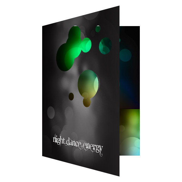
Uniquely shaped folders make a bigger impact because they seem more important. Your audience is less likely to throw away a die-cut folder because it isn’t typical and therefore seems “special” and worth hanging onto. Die cut folders are also more likely to be shared with others, meaning a better chance of attracting word-of-mouth business.
2. Use only original design elements
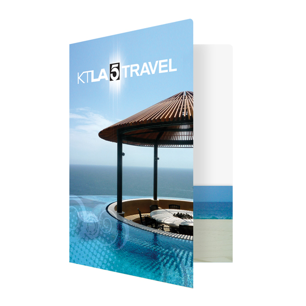
The folder designs that make the biggest impacts always have one common factor—original artwork or photography. Clip art and stock photos might be okay in a pinch, but they can’t be used to accurately portray a brand because any brand can utilize them. Your design could look a lot like someone else’s design, which leads to brand confusion and damages your reputation as a designer.
Original designs make the brand feel more authentic and real, whereas stock photos always look fake and a bit deceptive. For example, if you use a stock photo of a model to represent a brand’s customer base, then you run the risk of the actual customer base being unable to identify with the perfect-looking model. Meanwhile, testimonials from real customers accompanied by a realistic picture can do more for a brand than any stock photo model ever could.
Using an original design makes a bold statement, both about the brand and about your abilities as a designer. Audiences are always captivated by designs that go above and beyond with creative photography or graphic elements . You rarely see people sharing and discussing designs that are heavily reliant on clip art and stock photos.
3. Mix multiple imprint methods
Using more than one imprint method can be an effective way to grab the audience’s attention since you can cover multiple design aspects at once. Common imprint methods include printing with ink, embossing, debossing and foil stamping. By themselves, each of these imprint methods can produce stunning results, but put together they’re even more impressive.
Embossing is one of the most versatile imprint methods as it can be used to make other imprint methods stand out. For example, combining embossing and foil stamping creates a three-dimensional metallic effect that looks more realistic than if the foil is left flat. Embossing can also be used to make your printed design elements look like they’re popping off the page.
You can also use more than one ink printing method to create different effects. When printing colored media, most designers go for 4-color process, which uses CMYK tones. However if you need a more accurate color for a logo or other branded element, you can spot print these areas using PMS ink. Mixing inks also lets you play with different effects, such as blending full-color photography with metallic inks.
4. Use color to make backgrounds that pop
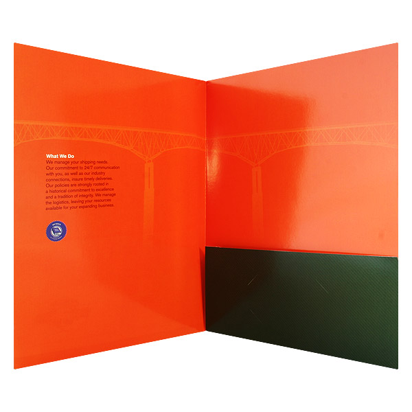
There are two ways to create a color background for your folder—you can use colored stock or print the background with ink. If you choose to print your background, you will have a greater range of colors to use than what is possible with colored paper. Not only that, but colored stock can distort your printed elements, so if you’re using ink as your primary imprint method, colored stock may not be an option.
Colored stock is also limited to just one color at a time, but with a printed background you can use any number of colors at once. That means your backgrounds don’t necessarily have to be solid colors, they can be a pattern or even a picture.
Keep in mind that if you’re only paying to have one side of your folder printed, it will still include interior pockets, flaps and other elements that are folded inside during assembly. This means your color or patterned background can extend into the interior. The actual interior panels themselves, however, will be left blank unless you choose to print on both sides.
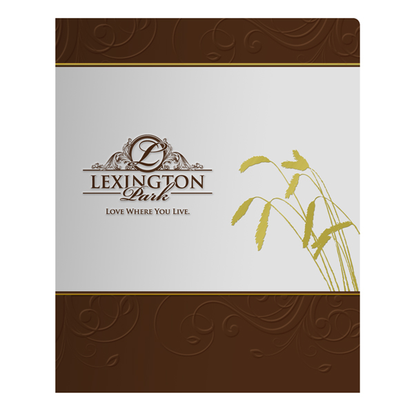
5. Consider the benefits of colored stock
Don’t write off colored stock entirely—there are still times when using colored stock can be beneficial to your design. Colored stocks pair well with certain imprint methods. Foil stamping, for example, looks better when used on dark stock, while blind embossing is more interesting when paired with colored stock.
Some designers actually like the distortion effects that are caused by printing on colored stock and use it in creative ways. It may be possible to print accurately on colored stock by printing an initial layer of white over the stock; however, not every printer is capable of doing so with complete accuracy.
The best aspect of using colored stock is a small, yet important, detail. When you cut through a piece of colored stock, it retains its color all the way through. This means the edges of the paper will match the rest of the folder. When you cut through a piece of white stock with a printed background, the edges will still show white because the ink cannot penetrate these areas.
6. Texturize your folder
![]()
A folder is a physical object, so your designs affect both sense of sight and sense of touch. When people use more than one sense to experience something, it creates a stronger impression on the brain. In order to ensure that people remember your folder, add texture to heighten the way your folder feels.
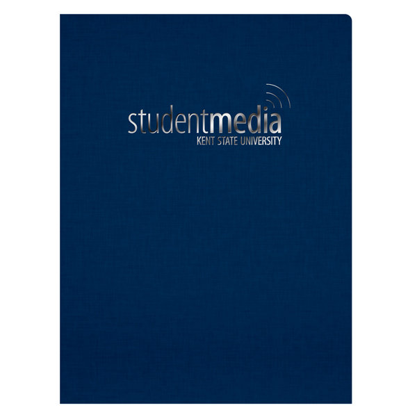
The first thing your audience will notice is your stock’s texture. Using textured stocks such as felt, linen or even eco brown kraft can be an easy way to add a different tactile sensation to your folder. The thickness of your stock can also be a factor, since thin stocks tend to have a cheap and less sturdy feeling to them.
If you want to add more texture to your folder, consider having select elements embossed or debossed. This imprint method is the best option for adding texture and encouraging recipients to touch your design with their hands. After all, have you ever come across a raised seal on a document and not given it a quick touch?
7. Finish your folder with special coatings
It’s common for most folders to receive a coating or special finish to help protect it from wear and tear. However, these coatings have the added benefit of bringing texture to your folder and certain finishes can even enhance the visuals.
Aqueous coating is a common option with presentation folders because it comes in multiple textures and styles such as gloss, matte, satin and soft-touch. UV coating offers little in the texture department, but it’s perfect for making your color designs look vibrant.
Spot coating options allow you to use multiple finishes on your folder, giving you a greater degree of textural variety. You can choose to have only certain parts of a design (such as a logo) coated in a different finish than the rest of the folder so that it stands out.
Conclusion
The easiest route to an uniquely creative presentation folder is to find a printer you like and to develop a strong working relationship. Not only is your printer going to be able to answer any questions you might have, they can also offer design advice and let you know what special options can enhance your folder.
Presentation folder images sourced from CompanyFolders.com.


i appreciate your emboss presentation folder designs that,s looks so creative. Presentation folder is an awesome type of marketing it is really useful in all kinds of present documents and all types of presentation,s it is impressive and creative thing.