Cool Coffee Websites for Designer Inspiration
When you are designing a website for a coffee shop or a small cafe, there’s plenty to consider. You need to create the cosy atmosphere of that particular place and make visitors almost feel the taste of fine coffee but not overdo images; be classy but not too boring, casual but not too messy…
Have a look at some of the great examples of coffee website designs below for good ideas how to do it.
1. Quills Coffee
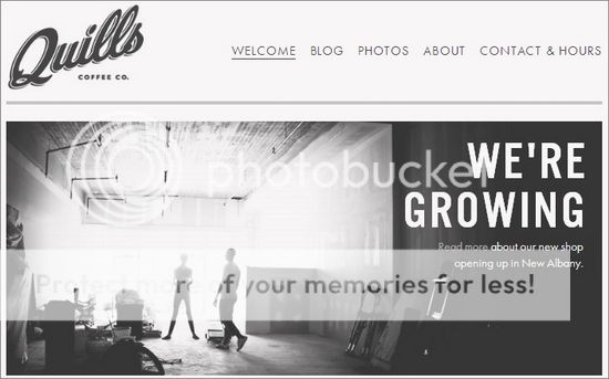
Plain and simple, yet very attractive, this website from Quills Coffee is a beautiful and inviting design that’s perfect for any coffee blog or website. The image of two coffee cups and saucers, which attracts attention, immediately tells the visitor that the website is all about coffee of some sort.
Using various fonts can have different effects, and it can be either a good thing or a bad thing depending on how you use them. The example featured here uses at least four different fonts on the homepage alone. It’s a common idea that using too many different fonts can make the website look messy; however, this particular design doesn’t look anything other than classy and professional.
Adding humor to your website homepage can encourage your visitors to stay and have a further look around. The humorous statement “Unicorns are pretty cool too.” gives a sense of hilarity and amusement, which would cause people with a sense of humor to want to read more.
The main colors used for this website are warm grays and browns, which give the website an overall warm effect. Using colors that complement each other well is essential for creating the perfect website.
2. Dunkin’ Donuts Coffee
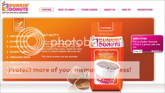
A bright and breezy website design is often very appealing, no matter what your website is about. This website design from Dunkin’ Donuts is witty, colorful and captivating. Pink and orange don’t seem like colors that would go together well, but the color combination works beautifully here. If you’re designing a coffee website for a cafe or coffee shop that also provides cakes (or donuts!), you could take a leaf from the book of the person who designed this website for Dunkin’ Donuts and display images of some of the delicious foods that can be purchased.
The orange background goes lighter towards the top of the page, until it is white. This prevents the background looking too dark and bright and causing visitors to focus their attention on the background of the website rather than the main images.
Many coffee websites that you come across will have an image of loose coffee beans or a large sack of them. Providing a photograph which shows where the coffee first came from gives the website a natural and pure feel.
3. Gorilla Coffee
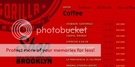
Although only two main colors are used for this website, it’s difficult not to admire the bold and busy appearance of the homepage. If you want to design a coffee website using just two main colors, the secret lies in choosing the right colors. To get the same effect as this particular website, select two colors that are very contrasting (red and black being the perfect example). The most prominent color of this particular website is red; however, the dark black used for the gorilla makes this animal stand out on the homepage, reinforces the title “Gorilla Coffee”.
Keeping the website design plain and simple is never a bad thing. Displaying too many different headings, subheadings and banners all over the homepage of your website can put visitors off and make it look cluttered. Use links at the top or bottom of the page so that people can navigate their way around the website and go from page to page easily.
4. Cafe Rouge
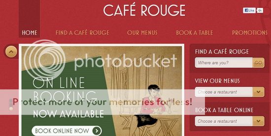
Unlike the other designs featured, the website of Cafe Rouge is bright and bold with lots of information on the homepage. The dark red background contrasts beautifully with the lighter beige colored foreground. Using the background color on the foreground (in this example, the links to other pages) creates a lovely effect as it brings the two colors together in a subtle way.
A large banner at the top of your website is a good idea as it allows you to build the web page around it. Having small images here, there and everywhere only creates a messy and untidy feel to your website.
The website featured here has other images below the main image. This allows visitors to find out more information before even moving onto another page. This style and design is perfect if you’re creating an informative website that’s packed with facts, news and articles about coffee.
Conclusion
When designing any coffee website, think about the impression that you want to create. If you’re looking to create a bold and bright impression, make sure your website reflects that. Alternatively, if the impression you want people to have of your website is elegant, dark and artistic, choose darker colors and effective images to get this look.
There are plenty of ways to design your tea or coffee website to render how tasty your products are, share yours in the comments!
Annie is a creative blogger for Dobovo, the free resource for affordable Kiev apartments for inspired travellers!


1 Response
[…] If you have been looking for some motivational stats to encourage you to quit smoking, here are 5 nicely-done infographics. Get inspired! […]