10 Types of Infographics to Perfectly Visualize Money Matters
A good infographic takes plenty of time, effort and inspiration to craft. This post is an attempt to give you ideas for the form and implementation: it lists 10 most interesting examples of informational graphics about money. Each infographic is an example of a different infographic type: can you name more?
Let’s see!
1. How We Spend and Save Money Online
Type: Bar Chart
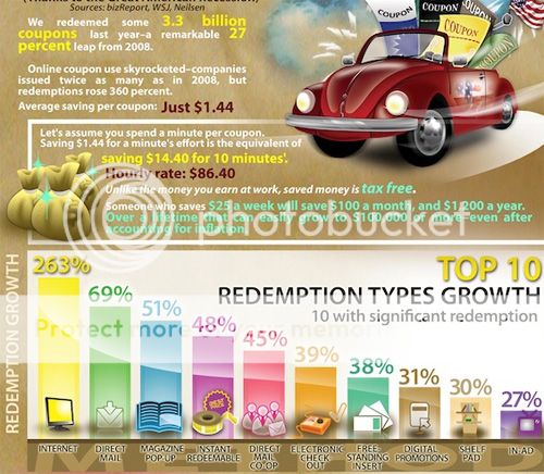
Via: Digg. Here’s an introductory article by Rather be Shopping on how coupons work and how to use them.
2. Most Expensive Cities in the World
Type: Comparison Chart

This picture is the perfect example of a smart usage of a comparison chart plus nicely done icons. This combination makes reading unnecessary: the complex idea is clear at a glance.
Source: Home Loan Finder
3. US Income Tax Brackets (1910-10)
Type: Color Infographic
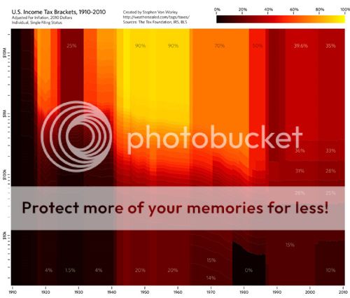
US Income Tax Brackets (1910-10) charts the historical U.S. income tax brackets for singles, adjusted for inflation, from 1910 to present. The best part of the infographic is the smart use of colors which indicate the tax rate: black for low, red in the middle, and yellow for high.
Source: DataPointed
4. Buying Your Own Island
Type: World Map Infographic
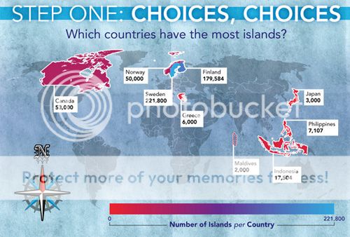
Have you ever wondered how much money you need to buy an island? Here’s a good answer.
A map is a very popular way to visualize any information, just because it operates very familiar forms and concepts. In this one, the map is used to show where you can buy an island and the color is used to visualize number of islands per country.
Source: Private Islands
5. Three Billion Gram
Type: Tree Map
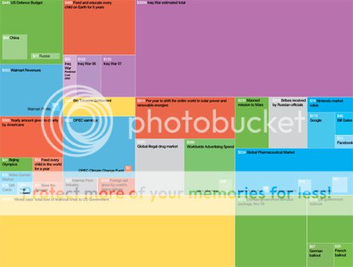
Three Billion Gram is the perfect example of the tree map visualization. It outlines the relative size of the different billion dollar spending and budgets in the news. The box size stands for the spending amount while the box color represents the topical similarity.
Source: Information is Beautiful
6. NASA’s Budget
Type: Timeline
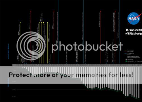
NASA’s budget infographic visualizes every year from 1958 through 2015. It was created by Robin Richards for an article in U.S. Infrastructure Magazine. The timeline visualization takes every year and compares funding with the selected missions. The great color scheme completes the whole idea.
Source: Timeline of NASA’s budget
7. Where is the Money?
Type: Venn Diagram
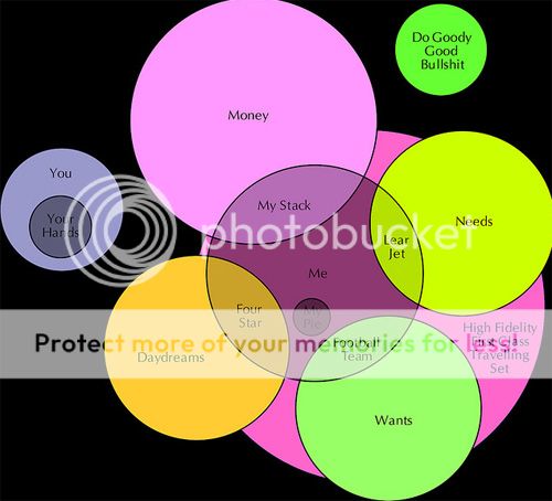
This money venn diagram perfectly explains what money is: i.e. it has nothing to do with “Do Good Things” and your needs.
Source: Flickr
8. Do I Need Money Anyway?
Type: Flow Chart
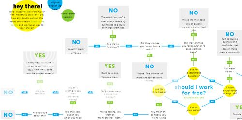
“Should I Work for Free” is the awesome example of a minimalistic flow chart design with lots of thought behind it. It can take you hours to browse, but like with most smart flow charts, it will be a fun ride!
Source: Should I Work for Free? via Live Silver Prices
9. The Crisis of Credit
Type: Animated Infographic
A video (or animated or motion) infographic is the most recent trend and it surely deserves a separate mention. This one explains the credit crisis and its origin.
Via Flowing Data
10. College Students’ Money Spending
Type: Pie Chart
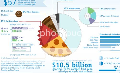
A pie chart is a popular way to visualize percentage break-down. In this case, the pie chart not only demonstrates the spending percentages but also represents the type: notice how each part of the pie looks differently based on which concept it represents.
Source: Wealth For Teens
Please share your thoughts and link to the best example you were able to find!


Thanks Ann, Keep Posting. Liked
awesome collection~~~~