12 Typography-Based Print Ads
Whether you’re in need of a fresh look yourself or simply appreciate the beauty of the written word, check out these 12 typography-based print ads:
1. Graffiti Sells
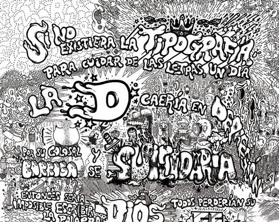
This beautiful poster combines the stylish art of graffiti with eye-catching drawings to get its message across in a hip and attractive way.
2. Handwriting, Printed
No matter how digital we become, the allure and attractiveness of the handwritten word still holds appeal as is evidenced by how often it is found in marketing print and this website advertisement serves as an excellent example of the uniqueness that can be achieved when old methods meet new methods.
3. Green Typography
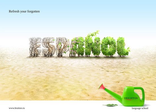
Green fever continues to grip much of the world’s population and the creators of this ad have obviously taken notice, using digitally-tweaked natural landscaping to do its talking for it.
4. Layers & Layers
Whether you give the credit for its fresh look to the textured background or the typography itself, there is no denying the great look of this fun layered ad.
5. Crafty Typography
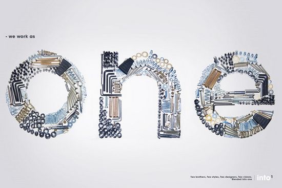
The use of crafty tools in order to create its commanding message gives this ad a look of busyness that is belied by its open spaces, allowing the viewer to focus on its message while the natural feel of the ad is quietly conveyed subconsciously.
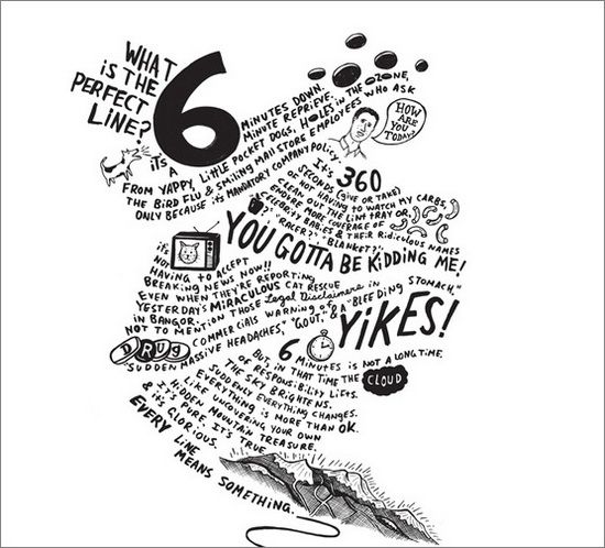
6. Freestye & Artsy

Obviously drawn by hand, this beautiful poster is another great and very memorable example of what can be achieved when visual art and unique typography are put to work together.
7. Half & Half
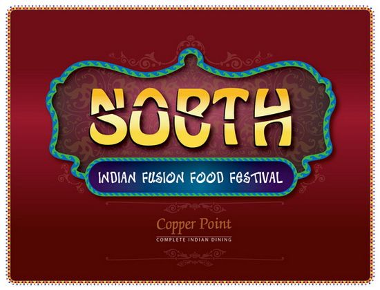
An interesting use of split text allows the makers of this piece to combine two words into one, creating an ad that begs to be further investigated while additional typography gives it a specifically Indian feel.
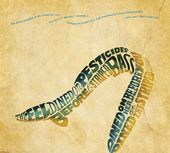
8. Deep Sea
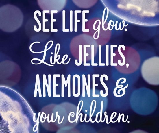
The natural background blends beautifully with the varied typography used in this marketing piece for the Vancouver Aquarium, creating a vibrant and welcoming scene.
9. Oh, Horror!
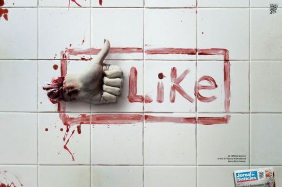
Making clever use of a common social media meme, this ad for a Portuguese horror film festival combines its unique flavor and message with an outline that will be instantly recognized by hundreds of millions of people around the world.
10. Ban Landmines
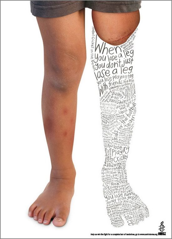
This charitable ad instantly grabs the viewers attention with its stark photographic background and the compressing of childlike text in the outline of a leg. While making for difficult reading, it is compelling in its ability to draw one in for closer and lengthier inspection, helping to further the cause it is championing.
11. Back & Forth Text
The seemingly awkward placement of the text in this ad make for difficult reading at a glance, working to compel viewers to have a closer look and quickly revealing that the text isn’t so difficult to follow, after all!
12. Modern Retro
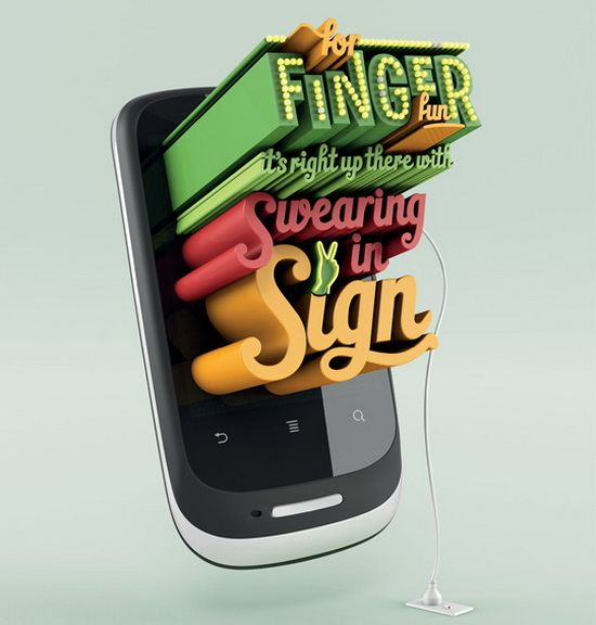
Combining the old fashioned style of retro text and neon lighting with an unmistakably modern smartphone gives this ad from mobile phone maker Huawei the ability to catch the eyes of readers and passers-by while the saucy message does the rest.
Kate is the creative writer for InkColour, providing the affordable printing supplies including HP ink cartridges.
Image Credits: 1, 2, 3, 4, 5, 6, 7, 8, 9, 10, 11, 12.


