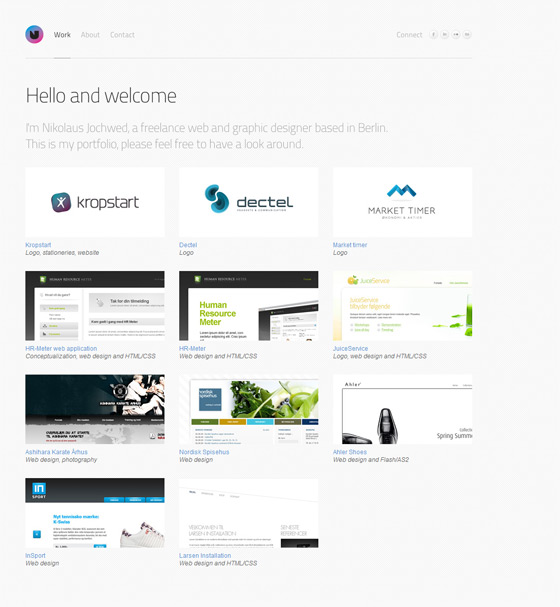
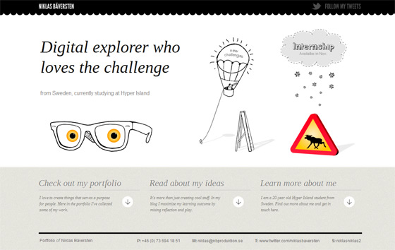
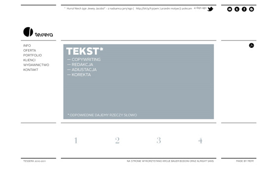
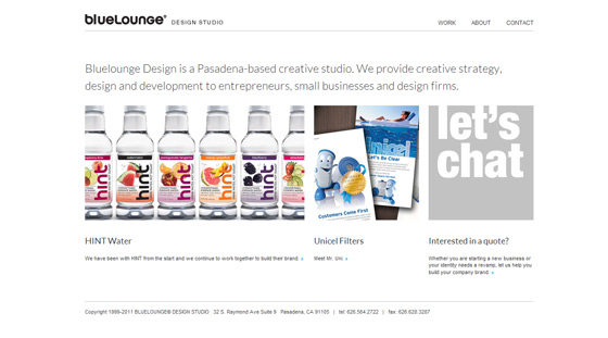
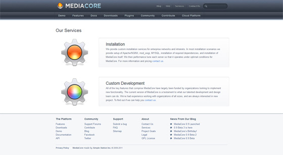
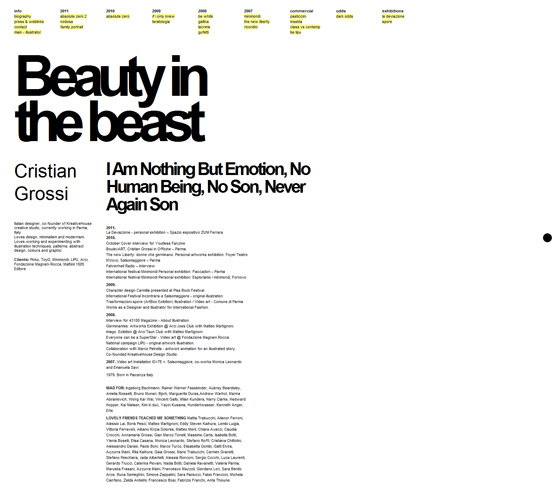
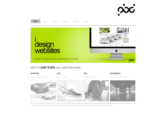
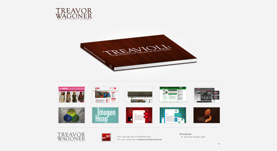
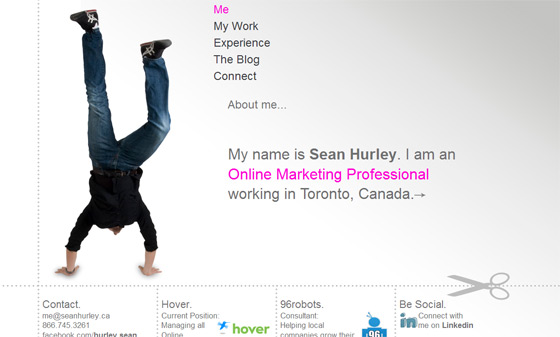
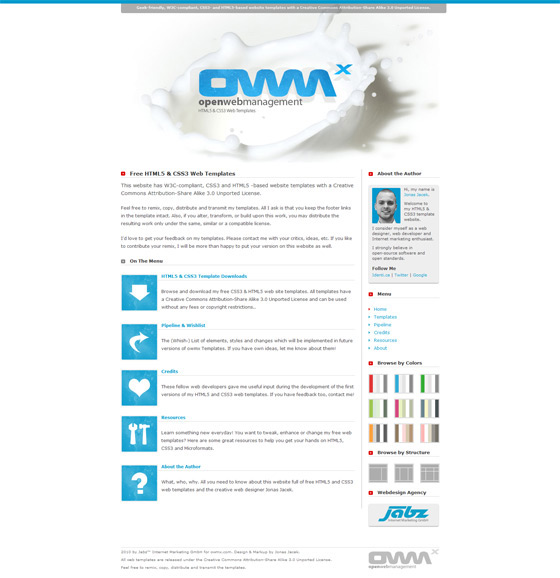
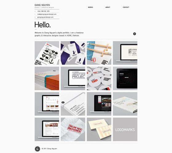
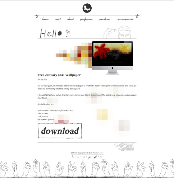
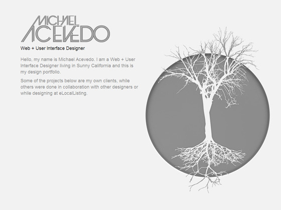
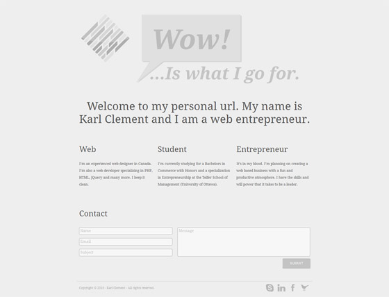
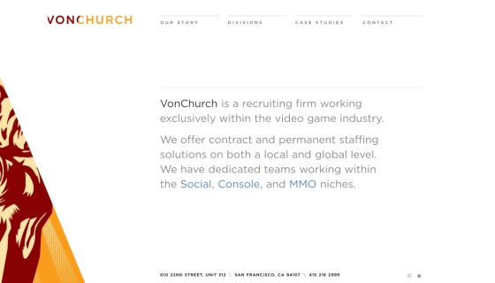
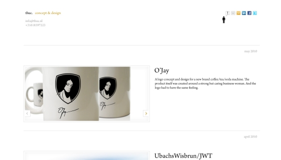
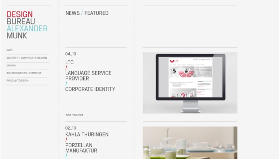
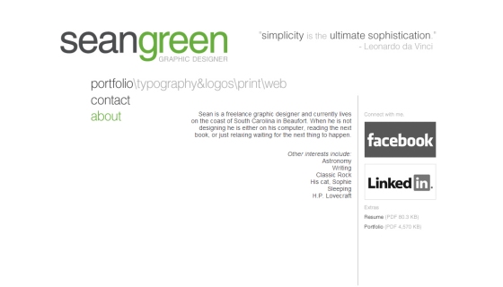
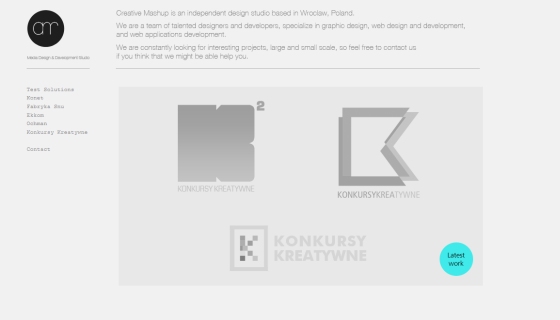
22 Clean, White and Minimal Web Design
Colors and layout are important aspects of web design, but this doesn’t mean that you can go and play around with the rainbow color to have your website look striking to the eyes or the worst, will look destructing to the eye. Consider also the layout or positioning of web elements, are they in the right place and looks harmoniously? What if a client requires you to come up a design that will lay on white color only and have a minimal elements on it? Here are twenty two examples of clean, white and minimal web design for your inspiration.
If you have a link to share, the comment box is open.

Looking for rental properties try Oakland real estate agent.


Wonderful selection of clean websites : white is pure !
Great Examples.
Thanks
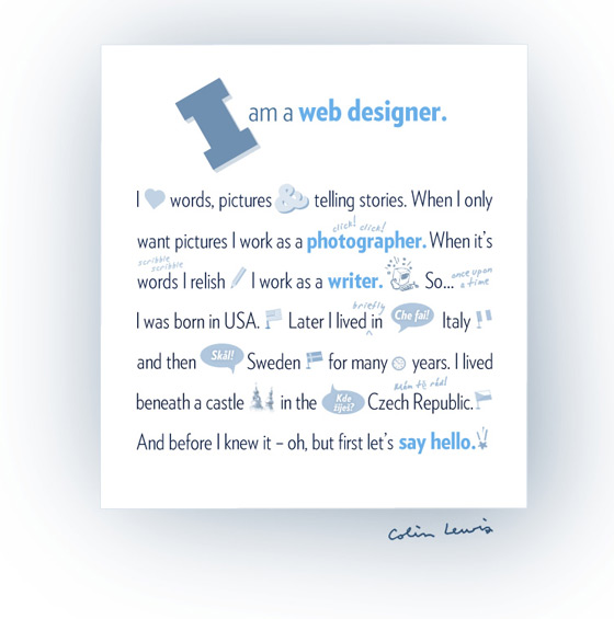
Nice collection of of clean and white web design collection. I like the http://www.colinlewis.se it having a nice and creative thought.
Growth of business is very fast to use this blog ideas in the future.
yeah, truly clean and very neat web design. I was doing research how to make a website fresh to the eyes and not so flashy. Your designs are great.
I love these sites! Clean and easy, the world needs more minimal websites!
Thanks for the great post. Textures do a lot to give a site depth. Nice collection.
Mars,
These are some beautiful designs. Really clean, I like it. I’ve worked with a lot of businesses in the past, and I’ve constantly noticed that they seem to have this notion that the more they have on their website, the better. False notion; the cleaner it is, the more appealing it is.
Cheers,
Eric 🙂
Hi Mars,
I believe we share the same passion. I like simple nice and clean web design. After I see your design It give me more idea to do with my design work.
Minimal design is one of my favorite styles. Usually we don’t realize how powerful this way of design can be. It is easy to navigate, comfortable for users and their interaction, and is simple and effective, especially if you have a website where content should be accented.
hi,
thank you for sharing such a great article with us,
it’s too good.