Many companies focus on the logo without paying much attention to the color selection when creating the logo. Colors help to instantly convey a message and invoke emotions whether or not any words or letters are even present, so careful color choice is a key factor when developing a logo design. What do you think of when you see famous company logos and instantly recognize them? Look to the logos that you like and other logos in your industry for guidance. We examine the 10 most popular logo colors here and show you how the colors of your logo can help with your branding, message, and appeal to your target audience.
- Black: When black logos are designed the right way, rather than seeming dark and ominous, your brand can appear serious, sophisticated and bold. Black can make your products seem elegant, high end, and classy. Some examples of brands that successfully use black in their logos include World Wildlife Fund, Playboy, Blackberry, Porsche, and The New York Times.
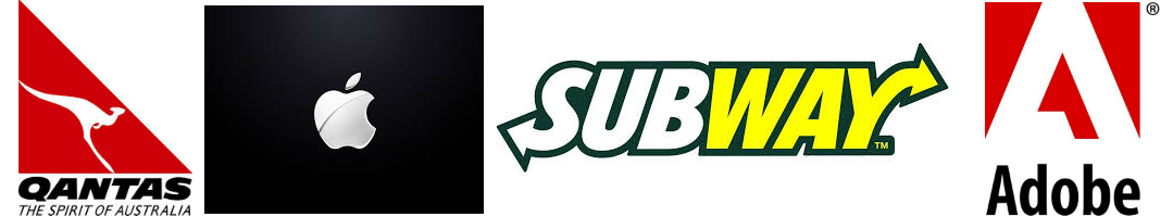
- White: Just like the classic cowboy movies, white in your logo can represent good. It can also reflect on your brand the idea of simplicity, cleanliness, and purity. Of course, logos are never completely white combining black and white are often used together to make a powerful contrasting combinations logo. Black and white together can represent balance, peace, and prosperity. White, whitespace, or black and white combined logos are stand outs in the following brands: Twitter, Qantas Airline, Subway, Adobe, White Castle, and Apple.
- Red: Red is a very strong color and should be used with caution since it can represent some things that might not lend itself to a positive image for a company. Stop, anger, and emergency are all associated with red. If you do not want to invoke any such feelings, you should try to focus on red bringing out excitement, passion, and energy. Companies that do well with recognizable red logos include CNN, the BBC, Coca-Cola, Nike, Virgin, and Levi’s.
- Yellow: Yellow is the brightest color on the spectrum and is used universally in all cultures around the world to represent the sun. However, like many colors, it has a dual meaning. Yellow is also known as a weak or cowardly color. To make sure that yellow represents your color in a positive light, choose bright yellow and use yellow as an accent color rather than the main color in the design of your logo. Sprint Nextel, McDonald’s, Subway, and Best Buy all use yellow to indicate fun and brightness.
- Blue: Blue is a very popular color for businesses. It is not only used for logo designs, but also often chosen as the primary décor for the interior of many professional offices. Blue is a color that represents calm, coolness, and trustworthiness. Many banks and companies that want to build your trust use shades of blue in their logo because it invokes feelings of trust, strength, wisdom, loyalty, and stability. Well-known companies with blue logo designs include IBM, HP, JetBlue, GE, and Samsung.
- Orange: Orange represents imagery of warmth, brightness and youthfulness. Travel companies often use orange in their logos, especially if they sell tropical destinations. Psychological studies show that orange increases brain activity, because of this it is often associated with learning centers, schools, and gyms. Companies that are known for their orange logos include Nickelodeon, Blogger, Home Depot, and Orange Theory.
- Green: Green is one of the colors that can have both positive and negative meanings associated with it. Try to avoid the negative connotations that green can bring like greed or envy. The positive aspects of green logos can impart ideas of earth, nature, and healing. Companies that have won over a positive image with their green logos include Starbucks, Sprite, Animal Planet, and the Cooking Channel.
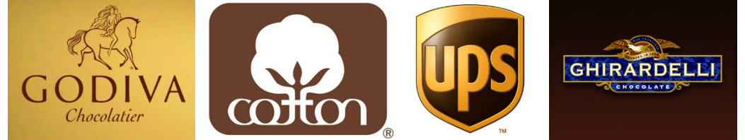
- Brown: Brown is yet another dual meaning color. If you are not careful with using brown in your logo, it can give the impression of being dirty. However, with logos brown usually means you are reliable, durable, stable, and wholesome. Companies with successful brown logos are UPS, Cotton, Godiva Chocolate, and Ghirardelli Chocolate.
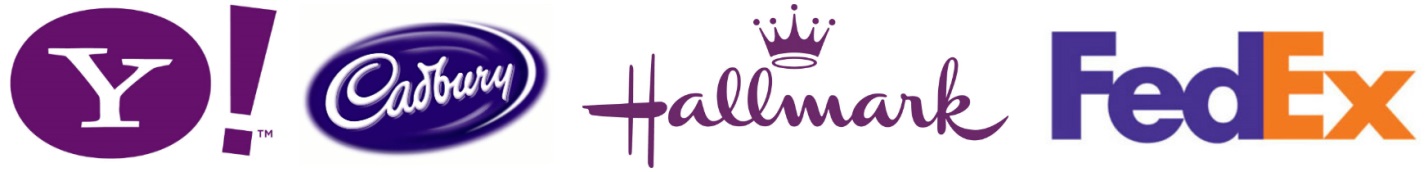
- Purple: Purple can really make your logo stand out since it is not a primary or secondary color and there can be different shades of intensity from lavender to dark purple. Purple can be representative of fantasy, magic, mystery, royalty, and wisdom. You might recognize the purple logos of Yahoo, Cadbury, Avid, Hallmark, and FedEx.
How to put this Information to Work for Your Logo
As you can see, many colors can mean different things to different people. That is why it is important to run a test study of your customers and target audience to see how your logo will appeal to them. As marketers and business owners, we test a variety of variables and since your company logo is such an integral part of your brand, this should be something you test out too.
Bio: Richard Larson is blogger and Brand Manager for GoPromotional.com. He enjoys sharing business and marketing tips and ideas.