Logo design and creation is a big part of any designer’s trade, and being able to whip up a decent logo will ensure that you always have the skills needed to do those bread and butter jobs that keep food on the table.
For this tutorial I will be showing you how to create a cool logo from start to finish. For the purpose of the tutorial, the name of the company will be ‘Book’ and let’s say they are a company which sells book apps for the iPad.
Let’s get started.
Step 1: Basic Setup
For this we’ll be using Adobe Illusrator. Create a new document, any size you like – for this example I’ll be using 800px by 600px, with web settings. This is a default setting with my installation of illustrator.
Step 2: References
Find any references you need. For this I will need a reference for an iPad.
Step 3: The Font
For this tutorial I already had a little look through my collection of fonts and was unable to find exactly what I was looking for, so I hopped over to http://www.dafont.com and had a little look at what was on offer that didn’t have any license restrictions.
To my excitement I came across a typeface called ‘Antipasto’ which was ‘Free For Personal Use’. As this tutorial is an example and the final product isn’t going to be used for any other purpose I decided to use the font. It’s clean and fresh, and suits this logo perfectly.
Download it here http://www.dafont.com/search.php?psize=m&q=antipasto
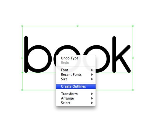
Step 4: Tweaking The Type
I was generally happy with my choice of font and didn’t really have anything to tweak except one or two things for the ‘B’ letter.
To edit the type and adjust the look of it all I need to do is right click on the selected type and navigate down the list that pops up to ‘Create Outlines’.
What this does is creates an outline of the type, adding anchor points, which is exactly what we want. Please note that once you do this you can no longer use the ‘Type’ tool to insert new characters as this is now a vector shape and not real text.
As you can see I removed the bottom part of the stem of the ‘B’. As well as removing these I also removed the ‘oo’ from ‘book’ as my idea for this logo doesn’t require them.
Sick Tips: To speed up workflow I find that learning some hot keys is really handy. A couple that use a lot are ‘V’, ‘A’ and ‘P’.
V: is a main Selection tool, this is used for selecting groups, shapes etc.
A: is a direct Selection tool, this is used for selecting paths and anchor points within groups and shapes etc.
P: is the Pen tool, used for drawing etc.
These are very simple hot tips but using them together to toggle between your tools really speeds up your editing process.
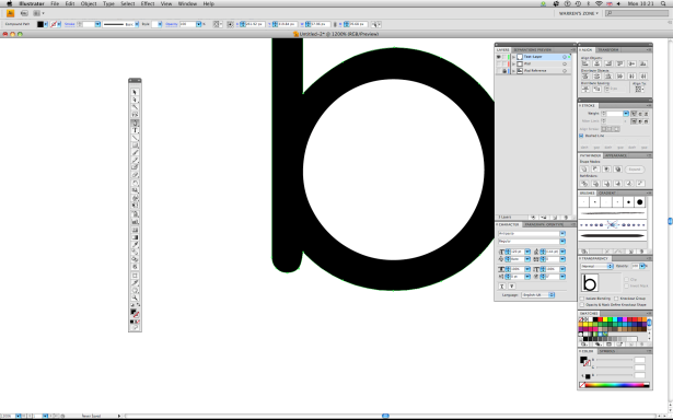
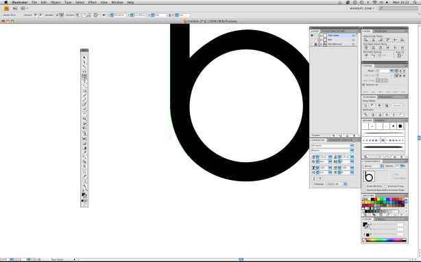
Step 5: Drawing Time
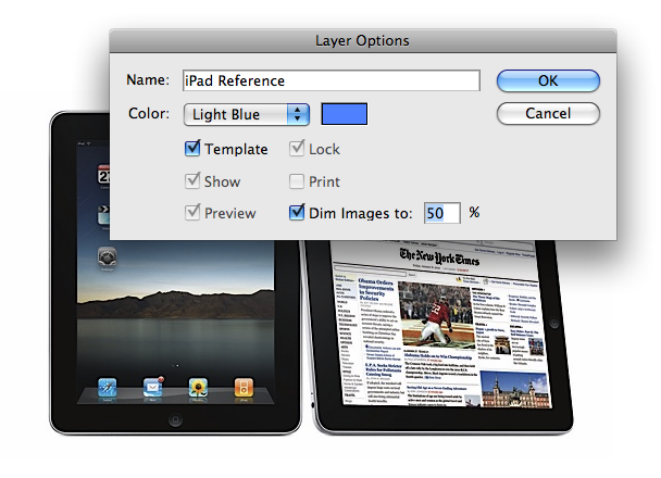
Turn the text layer off and create a new layer for the reference image using the settings provided.
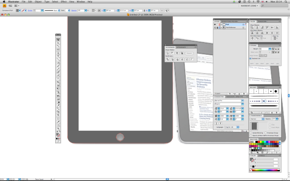
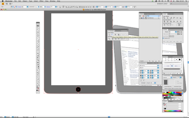
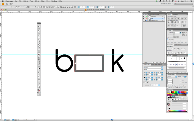
The graphics on this occasion were really simple so all I did was trace or draw the iPad, for this I used a rounded rectangle with a 14px corner radius, then I made the screen shape and the circle shape of the iPad. Once you have the basics select the iPad body and the screen and do the following:
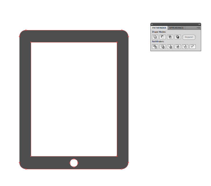
– Select the screen then shift+click on iPad body and select minus front.
What this does is creates a hollow frame removing the middle screen shape. Check the image out below.
Turn the text layer back on and turn off the template layer (with the iPad image on).
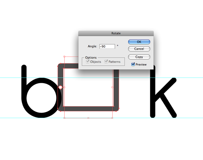
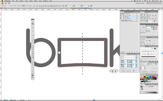
The next thing we need to do is combine the iPad and text together making sure kerning is still consistent. As the image has replaced the ‘oo’ of the ‘Book’ we need to make sure that the iPad accurately matches the requirements of the typeface, in order for this logo to work. To do this, just rotate the graphic -90 degrees and scale to fit the ‘Mean Line’ of the typeface. Use rulers and guides if this helps you.
As the basics of the logo are complete I started to add a few tweaks to the graphic.
As you can see I made the iPad a little longer; the idea of this was it would imply that it is taking up x2 letter spaces which in my opinion helped it read more like ‘Book’, whereas before it read ‘Bok’.
I was generally pleased with the outcome of this session so I put the document away and came back to it the next day – this always helps create the best version of your design possible. After looking at it with fresh eyes and a clear mind I realised I could really inject some more of this ‘Book’ idea into the ipad. Here’s what I did.
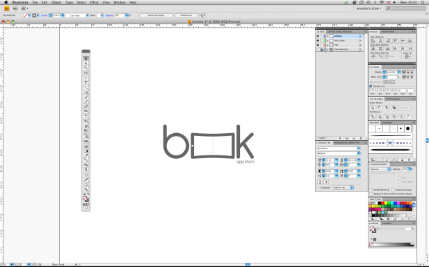
I added a total of 4 anchor points to the middle section of the iPad, using hot key ‘Shift+C’ then clicking, holding and finally dragging on the anchor point. This allowed me to create the curve above.
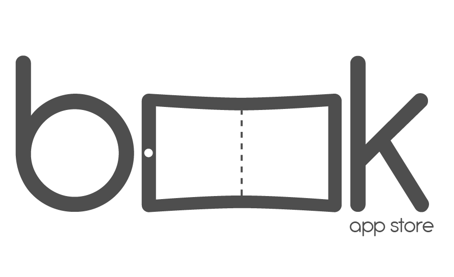
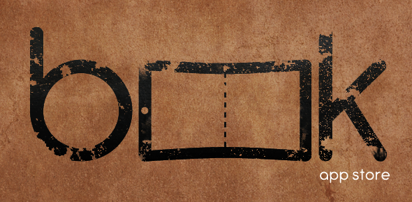
I also added a dashed stroke down the center to act like a page spine or break. Doing this also very subtly added ‘oo’ back into the logo, so that it read even more like the word book. I also added ‘app store’ underneath the ‘k’ just to finish the logo off, using the same typeface as before.
Tidy Tip: To make a copy of the internal path of the iPad, copy it and paste it then align it to the center of the iPad.
This is done by selecting the new pasted layer, holding shift and clicking the main ipad image then releasing shift and finally clicking on the same image again. What this will do is select the back iPad image as the ‘Key Object’. Once this is selected it should look like this: Align Objects + Horizontal Align Center + Vertical Align Center.
BOOM! Done?
So that’s the logo completed, very simple and pretty bareback.
Here I took the logo one step further and added a cool grunge effect using some tricks we won’t cover in this tutorial. However, here is the url to get you started: http://www.bittbox.com/freebies/free-high-res-grungy-paper-textures Play around with the design yourself to see what you come up with – a logo design is over finished when you run out of inspiration!
That concludes my tutorial on creating a simple logo using Illustrator and maybe 0.1% of Photoshop.