6 Crazy Design Tips for Your Social Media
Let’s be honest humans are crazy for creative things; we all crave for beauty and unique things. It’s almost like we are obsessed with things which are visually pleasing to us. We are so into finding pattern and beauty in things we see daily.
And this is not something that we have developed with civilization; it’s what is in our blood.
In our brain, thousands, oh! Let me correct that millions of neurons are devoted to our visual processing, isn’t that astonishing? Almost as much as 30% of our entire cortex contains these neurons which are far more in comparison with touch and hearing.
Our optic nerves carry signals from our retina to the brain, and those too are in a million, which is way more in comparison to auditory nerve which carries just 30,000 of them.
Now, that is more than enough for knowing how vital is it that social media images are good so that your content can reach a wide range of people.
The people who are engaged in making some wonderful pictures for social media know this very well, and they give a great amount of time to make it worth it.
There are few things that might help you get an amazing social media attention with the help of the graphic design that you might want to upload. In this article, we will do our best to help you enhance your social media images.
So, what are we waiting for? Let’s dive in!
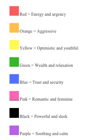
- Using Colors to Brighten Your World
Colors! The Royal Purple which gives an amazing pleasure to our eyes. The cute pink and romantic red.
Isn’t it wonderful how color shapes our views? It changes our mood and creates an atmosphere. It is more than what our eyes see; it’s something deep, something that makes us feel about a certain emotion.
Some of them are soft and give a gentle pleasure while others are strong and give us confidence.
In a study it is found that colors have a huge impact on marketing, it is found that more than 90% of the judgment about snaps are made about the product just on the basis of color and then depending on the product.
In other studies, it is found that colors indicate a certain personality and help in either creating your brand and if not used properly then even destroying your brand name. So, everyone should try to understand colors and use it for his or her benefits.
Here’s What Colors Indicate in General:
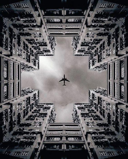
- To Maintain Balance
Basically, there are 4 different types of balances. But before discussing that, we must know how essential it balances the art in the world of social media. It’s really hard to do so, and hence, you must put a good effort in this.
To have an ease with this, you can just imagine that the elements of the design have weight behind it.
It is important for you to know that different elements have different importance or you can say they have different weight. Here are the 4 types on which the balance depends:
- Radial
- Symmetrical
- Asymmetrical
- Crystallographic
When all of these factors come together, they form an awesome social media design.
The Role of Asymmetrical Balance is to create tension with the help of contrast and to make it visually amazing.
When you create an image of your own, try to use as many factors as possible in your favor. Play with various things such as the darkness of items, size, warmth and orientation of course! There are again many more things to consider whilst clicking the perfect picture.
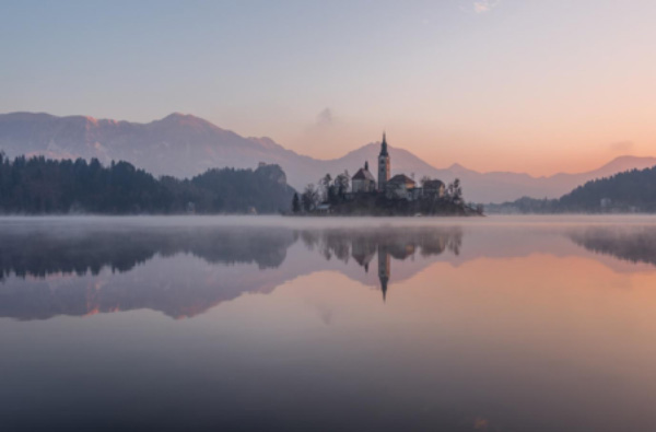
Check out this picture from Unsplash.com to get an idea how to capture the moment.
- Lines that Draw Your Future
Lines are underrated but one of the most important elements of any photograph. It leads your audience to the journey of the picture; it defines the paths and the stops. It works like a full stop and a new point for a start.
It is more than the connection of dots; it connects us. Lines can change the perception of the audience; these can give new meaning to even a blank page. If you still don’t believe me check out this picture by Muti from studiomuti.co.za
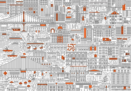
The clean lines take off your eyes easily from one path to another, and it’s so smooth. This creates a unique section and tidiness and certainly is very organized.
Now, check out this picture from the same artist:
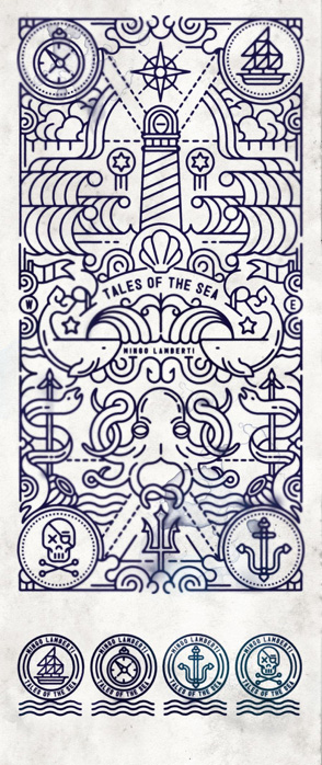
Did you notice how the curved lines create a unique sense of motion? It takes you off from one point and moves you around the picture smoothly and lands you back to that same picture.
Whilst drawing lines pay extra attention where you want your audience to focus and where you want them to go, be the boss of their journey through your art.
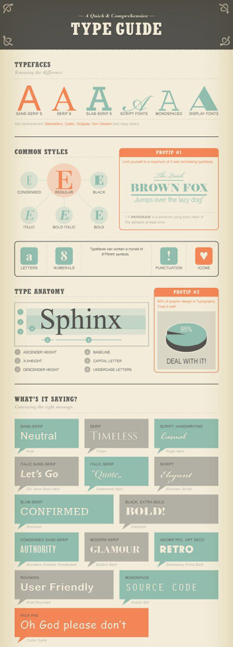
- How To Be Master of Typography
Typography has more than one reason to be one of the most important elements. It’s art; it helps people to know how to feel about the words they are reading. It is essential to keep one aspect in mind before deciding which font to choose, and that is its readability.
Just try to be good, originality matters but what will you do with it if that’s not even good?
More than what fonts you use, the thing that matters more is whether it’s readable or not. We realize that the following tips will help you understand some of the major things:
- Your design should have maximum of 3 type face
- Be sure that your font size fits well in the medium you are publishing it to
- It is well known that serif fonts are the best option for printing but when it comes to web sans-serif wins the game
- Use Kerning in your titles; it is an amazing technique
This short guide may help you understand more about fonts:
- Scale
Scaling helps you to have your audience’s focus on one thing by zooming in and still giving the small elements their desired importance.
It helps in Typography and to present different elements in a single picture. See this image and do you see the beauty of size?
This is what size does. It directs the attention of your audience to one thing and that is exactly what you need.
- Hierarchy
While creating an image for your social media, you will deal with many elements, and it’s crucial that in the process of creating a beautiful image you don’t lose track of the most important information present. Hierarchy is one the best tips to maintain balance and to help you get the attention of your readers to the main message, while still not pushing other elements out of the light.
Try to establish the main message as the focal point and then use another element to highlight it whilst still being there and giving it certain gorgeousness.
Once you are done with your main message, you can move on to the next important message and try building a great place for it.
Did you notice how the main message is standing out?


