Recession is a normal part of business cycle. During recession there is a significant decrease in economic activity that may last from 6-18 months. Slump in the economy is accompanied with fall in employment and significant drop in consumer demand. There are many reasons that may trigger recessions and businesses should be prepared with contingency plans to survive such crisis period.
Some major brands gear up with unique strategies to overcome crisis of recession. They devise strategies to reposition their products and brands. Coming up with a refreshing logo design is one such strategy. It has been observed that some major logo redesigning takes place during or after recession. Corporate brands try to make their customers feel better and the logos tend to be welcoming and livelier. There are some common elements used by logo designers for redesigning logos after recession. Let us focus on some of them.
Use of lowercase
Use of lower case is believed to deliver message of the company in a welcoming tone. While use of uppercase letters stand for dominance, lowercase letters can bring down the tone to an intimate and inviting mood.
Logo design of the famous food company – Kraft got a facelift. The letters are now in lower case. The word “food” has been added and the bold red border was replaced by a smiley styled stroke and multi colored flower. Overall, the redesigned logo appears more inviting.
Similarly logo design of the burger chain “Jack In The Box” was overhauled to give a playful mood. The red square was replaced with the red “dice”. Except J of Jack, all letters of redesigned logo are in lower case. Happy and playful mood was further enhanced by the smiley styled K of Jack.
This media group is associated with finance and business related news. The change in logo design is simply done by replacing the bold uppercase letters with softer lowercase letters. Use of lowercase has made the logo less imposing, more legible and friendlier.
Use of bright colors
This seems like an obvious choice. When you are fighting a downturn or crisis you will look for something bright as a solace. Darker shades are toned down and bright shades are added to logo.
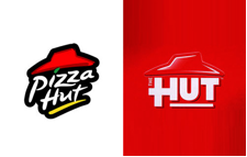
Logo design of Pizza Hut was simplified. The Red box is used for drawing attention. The word Pizza is dropped in new design and “hut” was redesigned to create a homely appeal. The logo design signaled that the brand intended to reposition itself as a family restaurant.
Logo design of 7UP was modified slightly to give it a refreshing new look. The green brush stroke has been replaced by two overlapping circles of green and yellow. The colors stand for freshness and happiness. “UP” is more focused on the bright red circle. Overall the new logo design is more balanced and colorful.
Adding informal symbols
Logo design of Wal-Mart got a refreshing, informal and cozy look post recession. The bold blue fonts were replaced with softer lowercase fonts in lighter shade. The iconic star in the middle was replaced with a sunshine type yellow icon, bringing in a happy mood. People distressed with recession found these subtle changes refreshing and inviting. Core client base of Wal-Mart grew even during the recession.
Logo design of Fanta was modified to give it a more stable look. The swirl and unrest of the earlier logo was replaced by some informal and cute designs in shades of orange, slices of orange and the name appeared to be more stable. Overall the brand stressed on stability and refreshing looks post recession.
Logo design of this chain of stores was modified to attract more people. The bold letters were replaced by softer fonts. The imposing red stroke was replaced by a cute icon similar to the font shades. Shades of green and the informal symbol made the new logo design attractive.
Complete Overhaul
This is an example of complete overhaul in logo design. The imposing shield like icon in green was replaced by a flower. Base colors (green and yellow) remain unchanged only more shades of them were added. Name of the company was taken out of this new icon and placed on its top right corner in lower case. Overall a great redesign to attract more people and create a refreshing look for the brand.
This logo design is another example where bright color and new icon has been used in redesigning. Name of the company is followed by the icon that represented speed. While yellow shade helped in creating a jovial mood, the icon seems to represent speed. Bold fonts were replaced with softer and straighter fonts. Overall, it is great makeover that evoked positive response.
Finally
Recession is a crisis period and logo design is a part of the survival plan devised by businesses to wade across this crisis. In absence of such proactive steps businesses may suffer. Wonder how logos of famous brands may look in absence of such crisis management!