The World of Typography Art
For artists out there, typography posters can be an extreme obsession. Endless and boundless amounts of searching and finding inspiration; hours, minutes, days, spent on creating your own creative ideas—let’s face it, typography is a “drug”. It affects us, pulls at our emotions, and makes us think in ways we hadn’t imagined possible.
Typography is the creative and clever way to rearrange a concept or image—mainly text based. Artists are constantly coming up with new and exciting ways of presenting ideas, and because of this, we’re lucky enough to be entertained endlessly. Throughout the year, we were supplied with a copious amount of amazing typography posters, making it hard to narrow it down. In this article, you’ll find the top typography designs to ogle at (yes, be prepared to drool at the creativity) and why these were the best of the best.
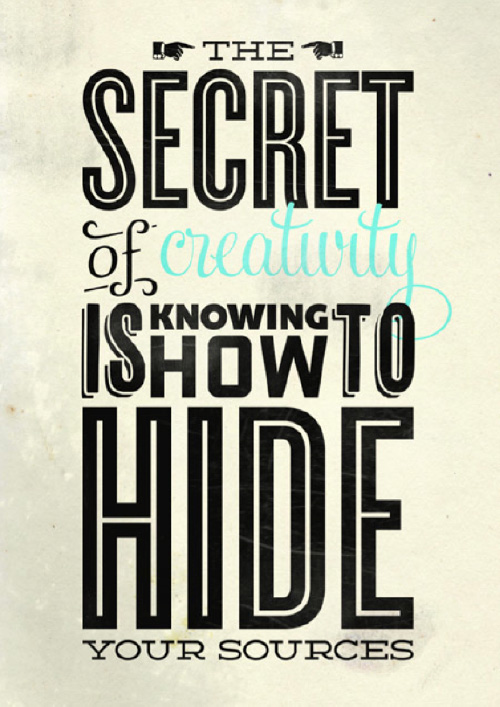
Figure one shows the first great example of a typography poster. It includes a quote that requires you to think, maybe even makes you laugh—all part of the graphic design business. It includes different fonts, different sizes, and a splash of color on the word “creativity”. This helps our eyes flow all over the page, instead of just focusing on one particular aspect of the design.
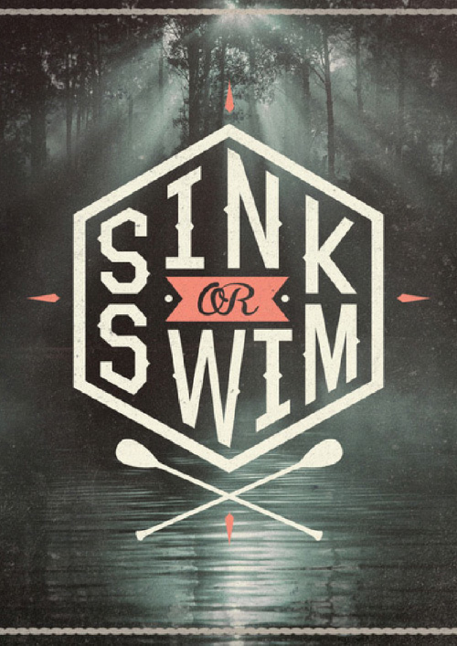
Figure 2 shows a great example of using space and images. “Sink or Swim” is in the center of a compass—a great analogy of the phrase. We also have a background image of water, as well as oars at the bottom of the page. This is visually appealing because of its simplicity, and almost relaxing feel.
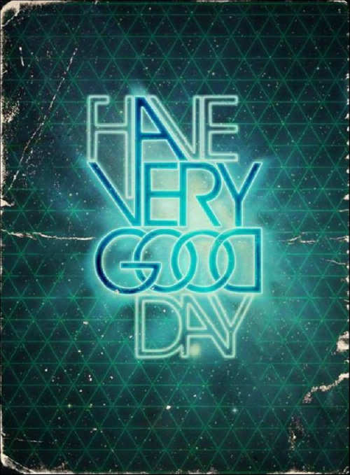
Figure 3 is a wonderful example of intertwining letters to create a complex (yet simple) idea. By doing this particular style, you’re intentionally requiring the reader to have to use their mind to rearrange your idea. It’s challenging, it’s fun, and it’s rewarding for the audience. It’s a fun twist on a simple idea.
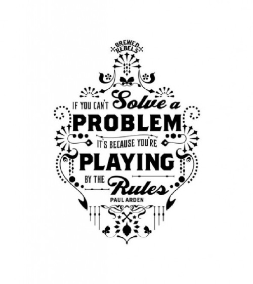
Figure 4 gives inspiration to add an intricate boarder to your design. It also provides another great quote; these sayings will pull an emotional response from your audience, which is one of the main goals of typography. Even though this poster is smaller in size, it reminds an artist that taking up as much space as possible isn’t necessarily the best choice.
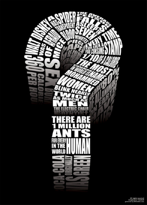
Figure 5 is a great example of using shape to portray your words and thoughts. The simple black and white colors have you focus directly at the image, and the words within to create the shape of a question mark. You find yourself reading as much as you can from this image; something the designer intentionally wanted.
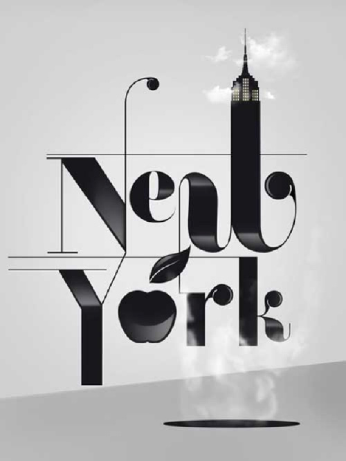
Our final image—figure 6—is a great representation of implementing iconic images into your design. In this poster, they’ve used the Empire State Building and the “Apple” of New York to categorize the feelings that people get when visiting, or thinking, of this glamorous city. The typeface is an Art Deco feel, pulling us back to the “famous” time and age of the city.
With all different artists, come millions of different ideas and designs. These images can help inspire you to create your own work, and can help you see why some typography posters are better than others. As long as you’re thinking outside the box, creating fun and interesting artwork, and including symbols/quotes/or representations of your main idea, you’re entertaining millions of people with the life eating obsession of typography art.
Julie Hartwell is a freelance writer who loves anything to do with the arts, design, and effective business marketing. When she’s not embarking on her own creative adventures, she writes about custom t-shirt printing for BlueCotton


